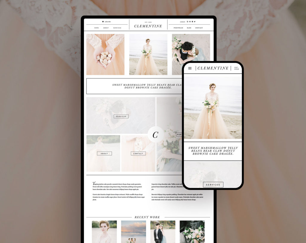
What makes a memorable website design that keeps visitors coming back again and again? If we look at trends, statistics, and basic design principles- there is a LOT we can learn about website design.
Here are my 3 tips for creating a Memorable Website Design
1. Make your website an interactive experience
Having moving parts is a great way to make your website stand out and stay top of mind for your viewer. There are many ways to make a website interactive, and you can incorporate some of these things on your website very easily. The obvious way is by adding video- either by incorporating a background video or inserting a youtube or vimeo video player on a page. I much prefer using videos as a background so that way it automatically plays and blends seamlessly into the design.
Another great way to add interactivity to a website is to add animations or transitions to different elements on your website. Instead of having everything be static on the page, you can add visual interest by setting transitions or animations to have them fade in, slide in, or even bounce. Showit makes it super easy to add interactivity to any element- text, photos, or graphics.
2. Use color psychology to your advantage
“Colors are the core of good web design – color alone increases brand recognition by 80%.”
-Source
It's no secret that color impacts our websites. If you want to create a memorable website design, I suggest choosing three colors for your color palette- one primary color, one secondary color, and one accent color. If you are unsure how to use these colors effectively, you can't go wrong with the 60/30/10 rule. 60% of the color used should be the primary color, 30% the secondary color, and 10% the accent color.
If you aren't sure which colors to choose, you can read more about color psychology here and how it can appeal to your particular audience.
3. Limit the number of website pages
This one may be a bit controversial, but I've seen far better results for my clients who have websites with less pages. (This does not include blog posts). Think about it: when you go to a website and there are 50 links in the navigation menu, it's probably going to make you feel a bit overwhelmed. On the other hand, when you land on a website with only 5 or 6 pages, it's much easier to explore the entire website and really digest the content. You're probably going to even spend more time on each page, because you don't feel rushed in order to view all of the pages.
Making your website visitors work less (aka click less) to find the information they are looking for is a huge plus. When I start a new website design for a client, I always encourage them to only plan for pages that they absolutely need instead of adding a bunch of filler pages and fluff.

