


")


When it comes to creating a user-friendly website, prioritizing your website menu design is key. Today I'm sharing my top tips for designing an intuitive website navigation.
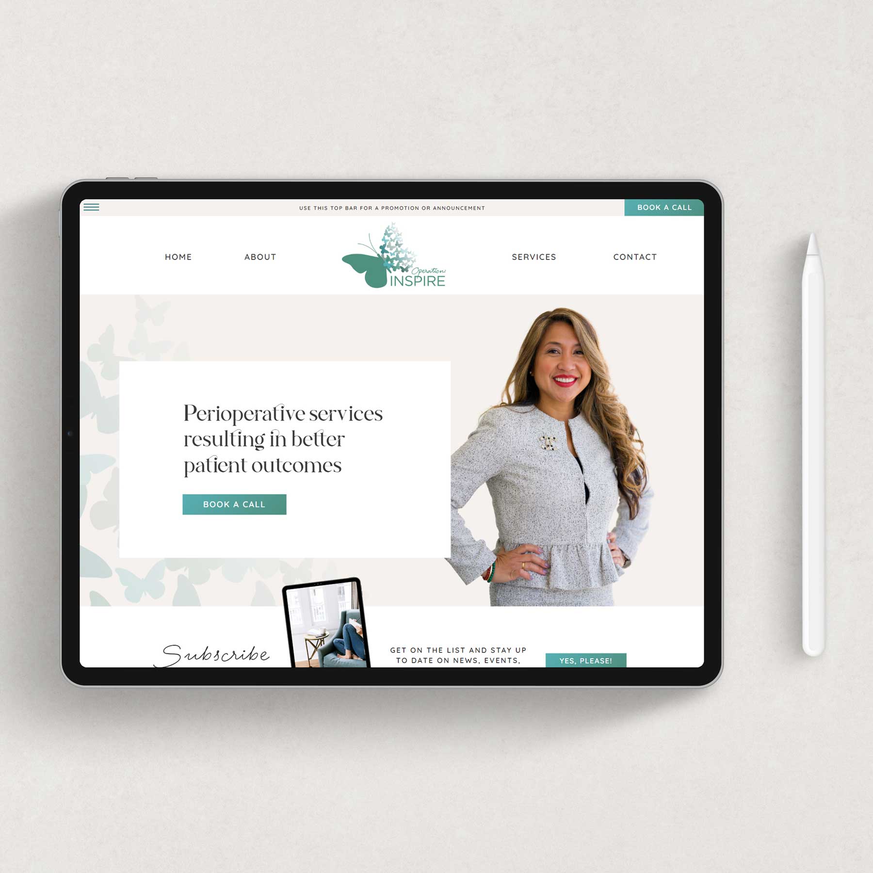
Website Menu Design Best Practices
A well-designed navigation system ensures that visitors can easily find the information they are looking for, leading to a positive user experience and increased engagement. In this blog post, I will explore some valuable tips and best practices for creating a website menu design that will help your visitors navigate your site effortlessly.
Keep it Simple and Clear
The first rule of a successful website menu design is to keep it simple and clear. Avoid overwhelming your visitors with too many menu options or complex menus. Stick to the essential pages and categories that represent the core aspects of your website. Use clear and concise labels for menu items that accurately represent the content they link to.
Use a Consistent Layout
Consistency is key when it comes to your website menu design. Use a consistent layout for your menu across all pages of your site. This helps visitors establish familiarity and quickly locate the menu, regardless of their location on your website. Consistency also extends to the placement of your menu, typically at the top or left side of the page.
Employ a Hierarchical Structure
Organize your website menu design in a hierarchical structure to create a logical flow. Group related pages or sections together under relevant categories. This helps visitors understand the organization of your website and find their desired content more efficiently. If you have many pages or a lot of content, consider utilizing drop-down menus or mini-menus on specific pages.
Prioritize Important Pages
Identify the most important pages of your website and give them prominent placement within your navigation menu. This usually includes pages such as Home, About, Services, or Products. By prioritizing these essential pages, you guide visitors to the core aspects of your website and ensure they don't get lost in secondary or less relevant sections.
Use Descriptive Labels and Icons
Ensure your navigation labels are descriptive and accurately represent the content they link to. Avoid using generic or ‘unique' terms that may confuse visitors. You can also incorporate icons alongside text labels to enhance visual recognition and aid in quick navigation. Use familiar and widely recognized icons that align with the purpose of each navigation item.
Optimize for Mobile Devices
Implement responsive design techniques to ensure your menu adapts seamlessly to different devices and screen sizes. Utilize mobile-friendly navigation patterns such as collapsible menus or hamburger menus to save space and provide a smooth mobile browsing experience.
Designing an intuitive website navigation is a fundamental aspect of creating a user-friendly website. By keeping it simple, employing a hierarchical structure, and prioritizing important pages, you can ensure that your visitors can easily find the information they seek. Remember, intuitive navigation is a crucial factor in engaging visitors and encouraging them to explore more of what your website has to offer.
Ready to take your website menu design to the next level and maximize your conversion rates?
Don't miss out on the opportunity to grab a comprehensive website audit checklist!


