Redesigning your own website is a very different experience when you’re a web designer.
You would think it would be easy. After all, I’ve designed hundreds of websites over the past 17 years. But when it’s your own business, the decisions feel bigger. There are more moving pieces, more platforms to update, and a long list of things that all need to work together.
After months of behind-the-scenes work, my new website is finally live. And along the way, I was reminded of a few lessons that are worth sharing if you’re planning your own website redesign.
Why I Decided to Redesign My Website
Like many businesses, my brand has evolved over the years.
My services have grown, my portfolio has expanded, and the way I support clients has continued to develop. It felt like the right time for my website to reflect where my business is today.
More importantly, I wanted the site to highlight the incredible businesses my clients are building. Their brands and websites deserve the spotlight.
This redesign was about creating a space that feels more refined, more intentional, and more aligned with this season of my life and business.
The Challenge of Updating Every Connected Platform
One thing people don’t always realize about a website redesign is how many other tools may be connected to it if you are an established business owner.
Updating my own design meant updating branding and colors across several platforms, including:
Flodesk email marketing and workflows
Dubsado forms
ThriveCart checkout pages
Course and product areas
Dozens of website pages
When you’ve been running a business for many years, all of these systems work together behind the scenes. Changing one part of your brand often means updating several others.
It was a good reminder that redesigning a website isn’t just about the pages visitors see. It’s about making sure everything connected to your brand stays consistent.

Bringing Back the Resource Library
One feature I was especially excited to bring back is my Business Resource Library.
Years ago I had a resource library filled with free downloads, and it performed incredibly well. It became one of the easiest ways for people to access helpful tools and connect with my brand.
Over time, those downloads ended up scattered across different blog posts and opt-in pages. During this redesign, I decided to bring everything back into one organized space.
Now visitors can access popular resources like my new Simple SEO Workbook, checklists, and worksheets all in one place.
It’s simpler, easier to navigate, and much more helpful for business owners who want quick wins for their websites.
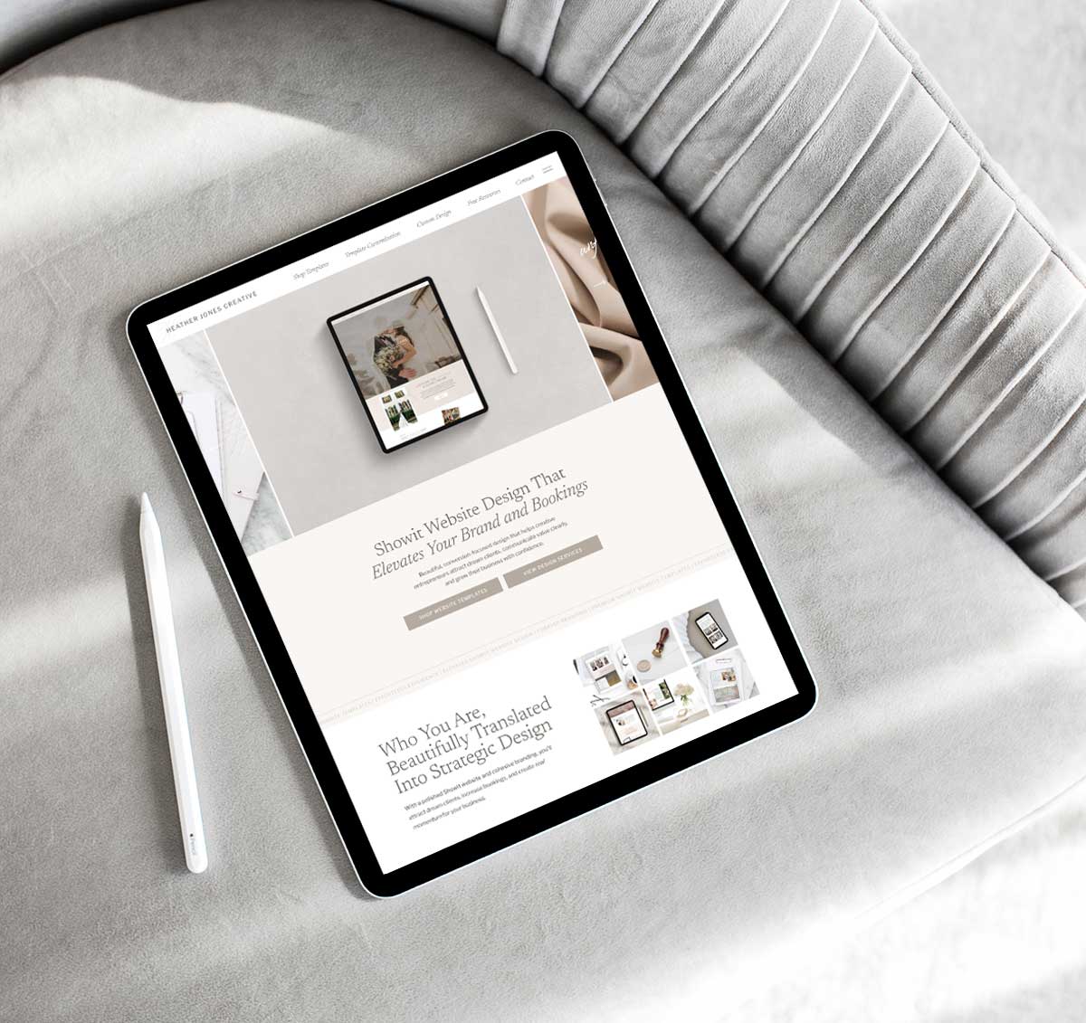
Choosing a Brand Direction That Reflects This Season
One of the biggest changes in this redesign is something longtime visitors might notice right away.
For many years, my brand included the color purple. In fact, it had been part of every website I’ve had since 2008.
This time, I decided to go in a different direction.
The new design uses lighter, softer, and more neutral tones. The overall look feels more feminine, classic, and refined.
More importantly, this approach allows the brands and websites of my clients to truly stand out in my portfolio. Instead of competing with their color palettes, my website now creates a clean space where their work can shine.
Redesigning Nearly 100 Pages in Showit
Another part of the redesign that surprised me was just how many pages were involved.
Between portfolio projects, template pages, category pages, service pages, blog templates, and landing pages, I ended up redesigning almost 100 pages.
It was a lot to work through, but it also gave me the opportunity to clean things up.
I removed pages that were no longer necessary, simplified layouts, and organized canvases inside Showit that had accumulated over time. The result is a website that feels much more streamlined and easier to navigate.
Reworking the Copy and Messaging
Design is important, but the words on your website matter just as much.
As part of this redesign, I revisited the copy across the entire site to make sure it reflects the direction my business has taken in recent years.
After nearly two decades in this industry, I wanted the website to communicate both my experience and my passion for design. Creating websites that help business owners grow is something I truly love doing.
This redesign gave me the chance to refine how I talk about my services and how I help clients bring their brands to life online.
Highlighting My Clients and Their Businesses
One of my biggest goals for the new site was to showcase my clients and their incredible work.
Their websites, brands, and businesses are the heart of what I do.
The portfolio features new projects and gives visitors a look at the variety of businesses I’ve had the privilege of working with over the years.
Seeing my clients succeed and grow with a website that supports their brand is always the most rewarding part of this work.
The Moment I Finally Decided to Launch
Like many designers, I could have kept refining things forever.
There are always small adjustments you can make or ideas you want to test later. But eventually there comes a moment when you have to stop tweaking and simply launch.
A website doesn’t have to be perfect to be effective. In fact, the best websites continue evolving over time.
At some point, you just have to press publish.
Final Thoughts
This redesign reminded me how much I still love this work.
After nearly 20 years in the web design industry, helping business owners create beautiful, strategic websites is something I’m incredibly grateful to do every day.
Whether someone chooses a Showit website template, template customization, or a fully custom brand and website design, the goal is always the same: creating an online space that reflects their business and helps it grow.
And sometimes, a redesign is the perfect way to start that next chapter.
I hope you love the new website as much as I do :)
Ready to refresh your own website? Explore the Showit templates, template customization, or fully custom brand and website design to create a site that truly reflects your business.