")


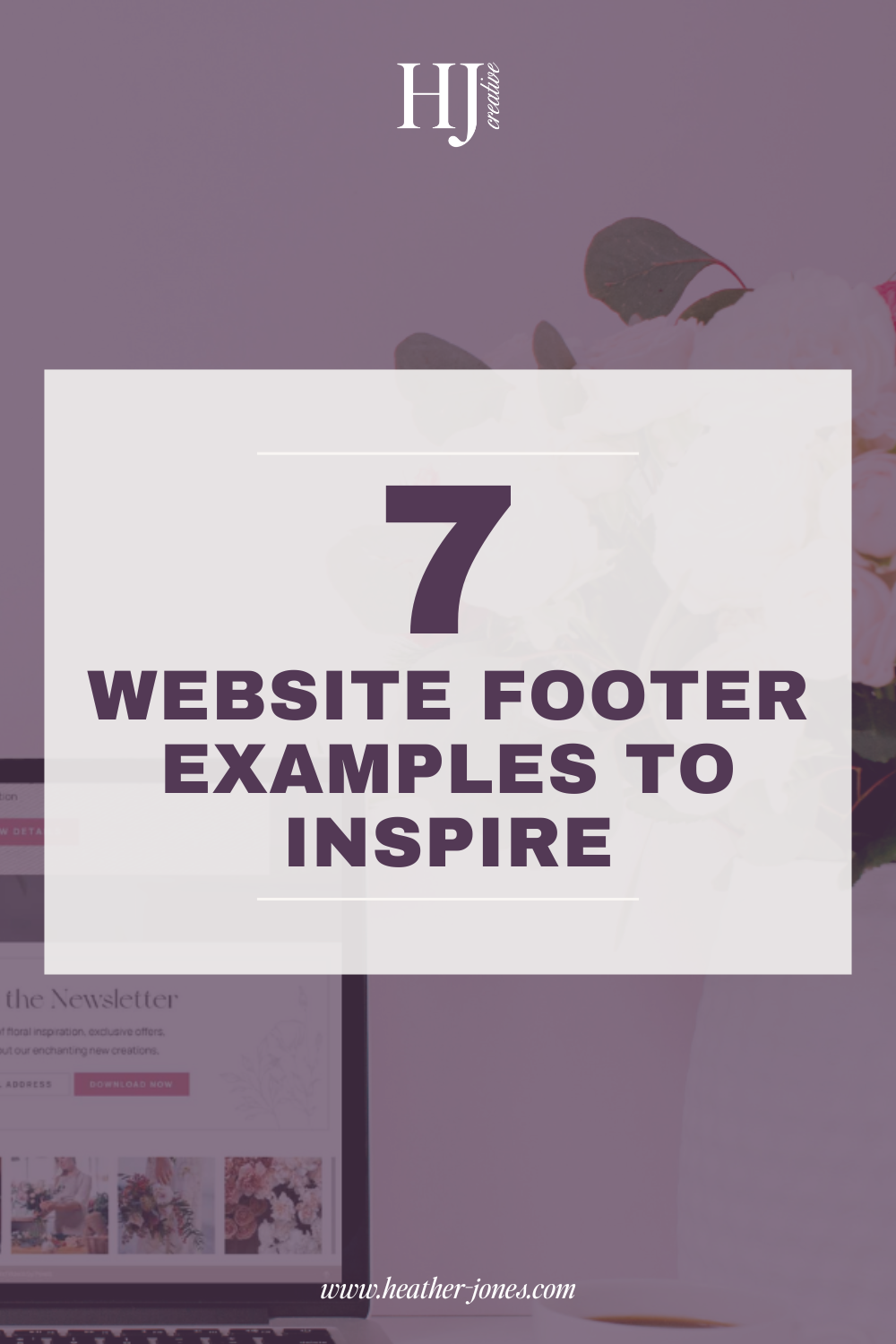
Website Footer Examples To Boost Engagement & Conversions
A website footer might be at the bottom of the page, but it plays a big role in user experience, SEO, and conversions. A well-designed footer can guide visitors to important pages, improve credibility, and even help boost engagement. Your footer is often the last chance to direct visitors to key actions before they leave your site, so it should be thoughtfully designed!
In this post, I’m sharing 7 website footer examples that show how to create a functional and stylish footer for your site. Whether you’re a service provider, creative entrepreneur, or eCommerce brand, you’ll find inspiration for crafting a footer that works for your business.
And remember: a great website starts from the top but ends with a strong footer!
What Makes a Good Website Footer?
Before we dive into the examples, let’s talk about what makes a footer effective:
- Clear navigation – Visitors should easily find key links like Contact, About, and Services without searching. Organized navigation makes it easier for visitors to take the next step.
- Consistent branding – Your footer should match your website’s colors, fonts, and style to maintain a cohesive look and reinforce your brand identity.
- Essential information – A strong footer includes legal links, contact details, and social media icons so visitors can connect with you easily.
- Call-to-action – Encourage sign-ups, inquiries, or purchases with a compelling CTA that guides visitors toward their next action.
- SEO boosting elements – Internal links, keywords, and location-based details can help improve search engine rankings and increase visibility.
- Mobile responsiveness – A good footer should be optimized for mobile users so it remains easy to navigate on any device.
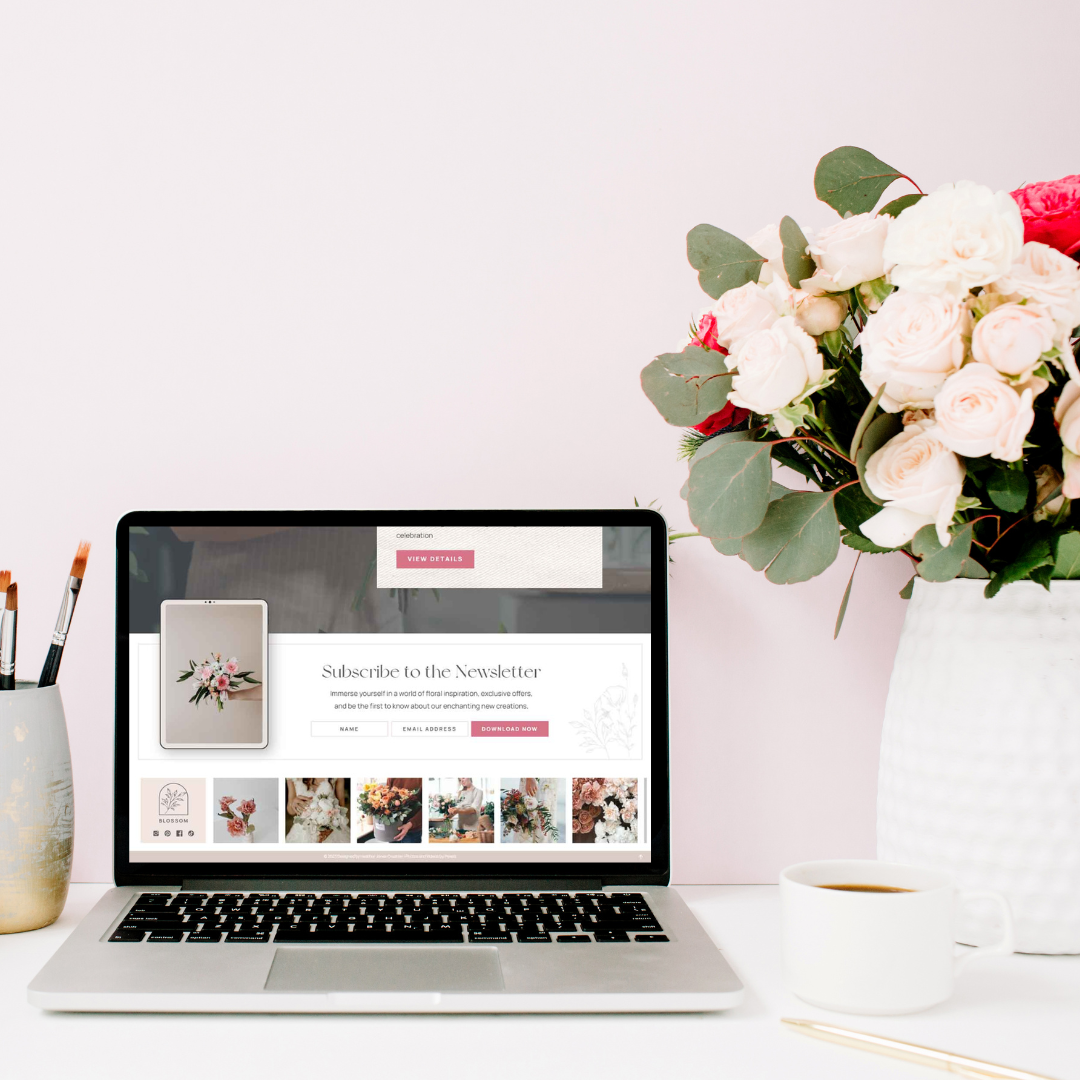
7 Website Footer Examples to Inspire Your Design
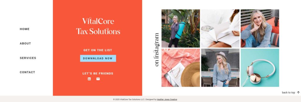
1. Footer That Has It All
This all-in-one footer design includes everything a visitor might need—strong branding, social media icons, page links, and a social media feed. It’s a footer built for engagement, ensuring that visitors can easily navigate your site, connect with you on social platforms, and get a feel for your brand’s personality. Bonus: It's pretty to look at too!
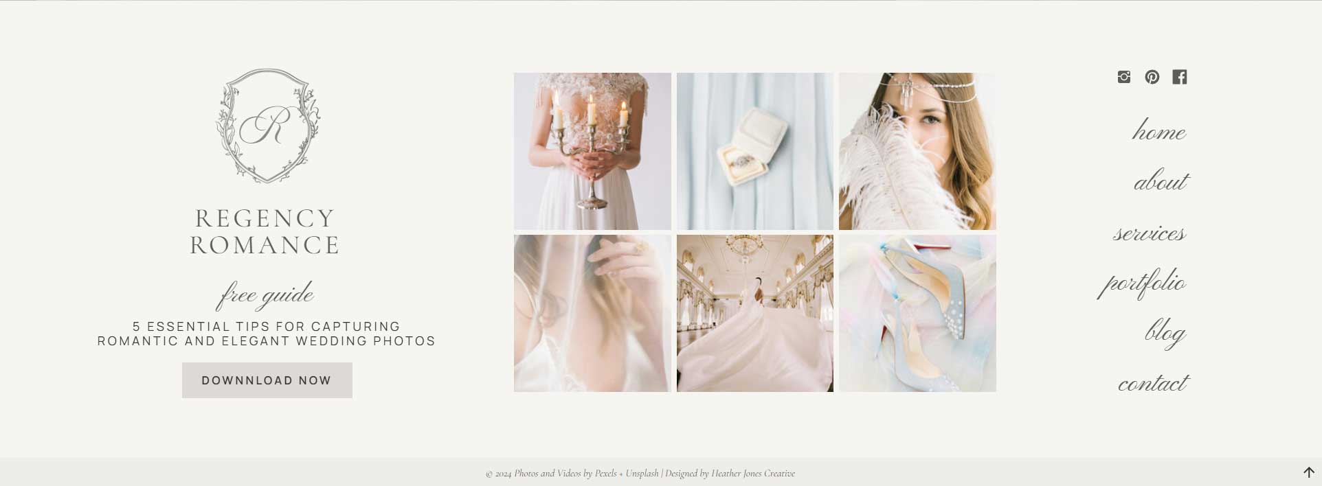
Best for: Service providers, creative entrepreneurs, and businesses that want a fully functional, high-impact footer.
2. Newsletter Signup Footer
Featuring a big and bold email opt-in and eye catching button makes this footer a conversion booster. Adding a compelling opt-in area encourages visitors to subscribe and stay engaged with your brand.
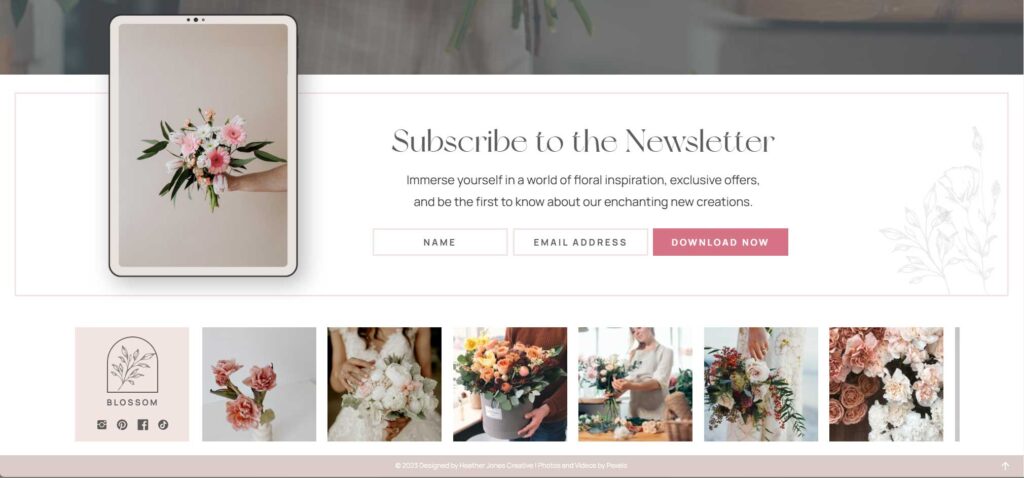
Best for: Anyone looking to grow their email list.
3. Bright & Bold Footer
A footer with vibrant colors, eye-catching typography, and high-contrast elements makes a strong visual impact. This design ensures your footer stands out rather than blending into the rest of the page. A bold footer can also be used to highlight key information like a call-to-action, social links, or an important announcement.
Best for: Creative brands, coaches, and businesses that want a fun, high-energy design that grabs attention.
4. Social Media-Focused Footer
A footer with a grid of Instagram posts or prominent social media icons can drive engagement beyond the website, encouraging visitors to follow and interact with your other platforms.
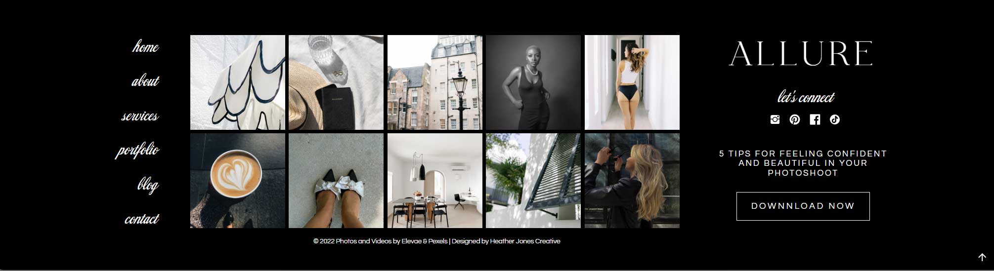
Best for: Influencers, personal brands, and content creators who want to expand their audience.
5. Footer with a Contact Form
Adding a contact form directly in the footer makes it easy for visitors to reach out without navigating to a separate page. This is especially useful for service providers and businesses that rely on inquiries and client communication. A simple form with fields for name, email, and message keeps it user-friendly while encouraging more conversions.
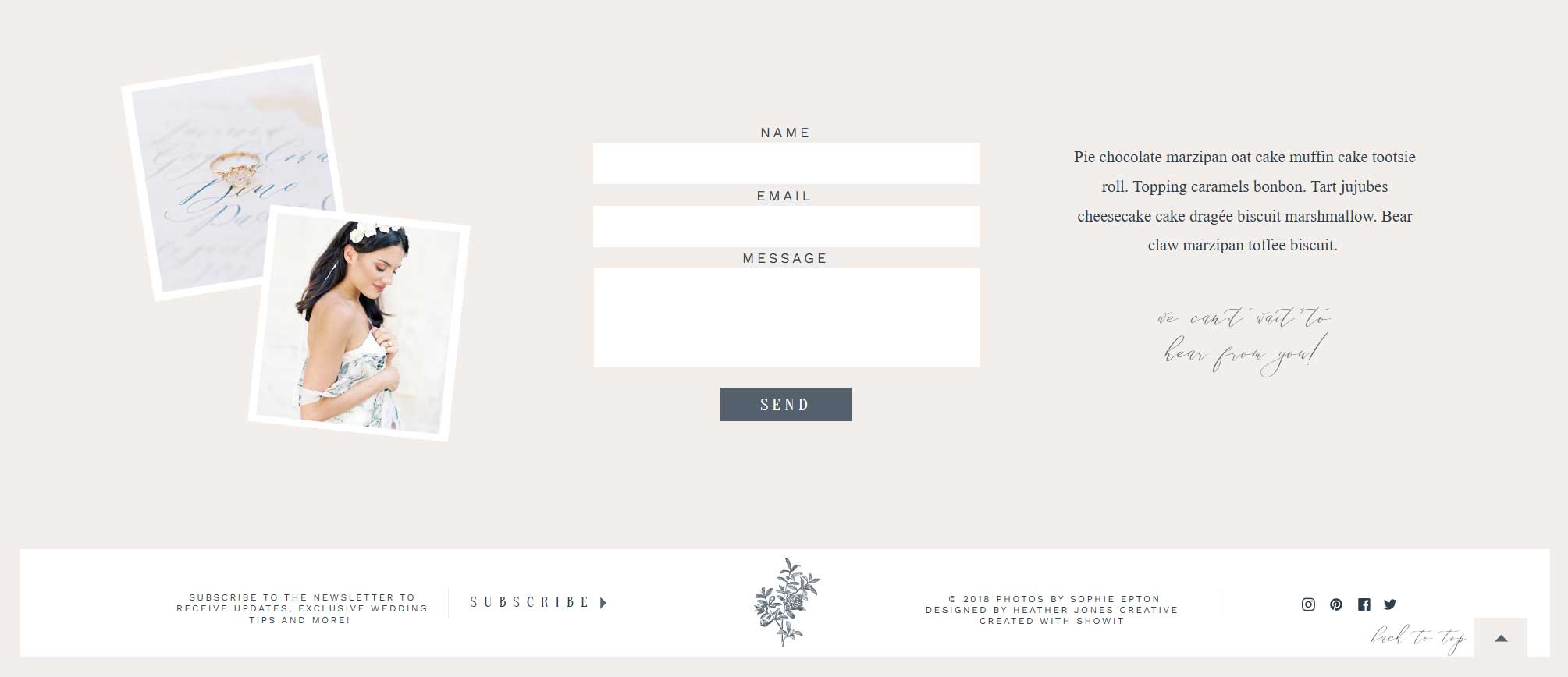
Best for: Service providers, freelancers, and businesses that want to encourage direct communication.
6. Footer with a Multi-Column Layout
Breaking the footer into columns (e.g., About, Resources, Support, Socials) keeps it well-organized and ensures visitors can quickly find what they need.
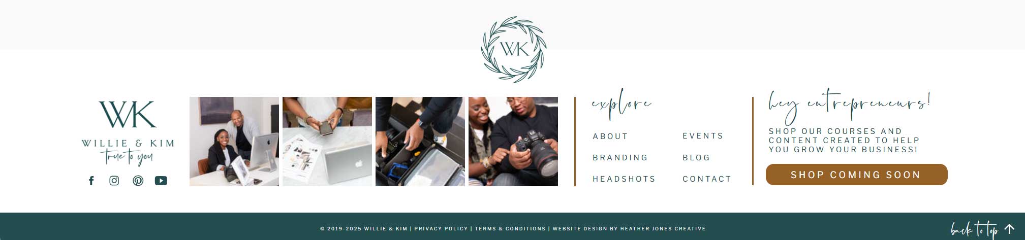
Best for: Businesses with multiple service offerings or large websites with extensive content.
7. Footer with Hours of Operation
Adding business hours to your footer makes it easy for visitors to know when you’re available. This is especially useful for service-based businesses, brick-and-mortar stores, and anyone who wants to set clear expectations for response times. Pairing it with contact details and social media links creates a well-rounded, informative footer.
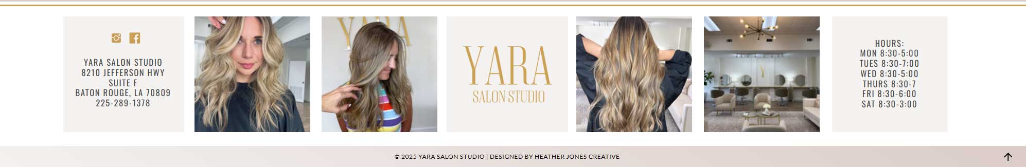
Best for: Local businesses, service providers, and professionals with set operating hours.
*All of the above footer examples can be seen on websites from my template shop and portfolio.
How to Design the Perfect Footer for Your Website
Now that you’ve seen 7 stunning examples, here are some quick tips for designing a high-converting footer:
- Keep it simple: Avoid clutter by only including the most relevant links and info.
- Make it mobile-friendly: Ensure the footer looks good and functions well on small screens, as mobile traffic continues to grow.
- Use a clear CTA: If your goal is conversions, add a CTA like “Schedule a Call,” “Shop Now,” or “Join the List.”
- Match your branding: Use your website’s colors, fonts, and design style for consistency, reinforcing your visual identity.
- Organize links logically: Group similar content together (e.g., customer support links in one section, legal policies in another) for easy navigation.
Need Help Designing Your Website?
Your footer is just one piece of the puzzle when it comes to a high-performing website. If you need a beautiful and strategic website that converts, I’ve got you covered!
Browse My Showit Website Templates – Perfect for creatives & service providers!
Work With Me for Custom Web Design – Get a fully tailored site that fits your brand and business goals.