Beautiful, free Google Font combinations chosen by a professional web designer to help your website feel timeless, refined, and unforgettable.

Your fonts speak before your copy ever does.
Long before someone reads your headline or learns about your services, they've already formed an opinion about your business.
Your typography is part of that first impression.
The right font pairing can make your brand feel luxurious, approachable, modern, editorial, or timeless. The wrong one can unintentionally make your website feel outdated or disconnected, even if everything else is beautifully designed.
After designing more than 600 websites over the past 17 years, I've learned that great typography isn't about choosing the trendiest fonts. It's about understanding balance, hierarchy, personality, and readability.
As someone with a Bachelor of Fine Arts, typography has always been one of my favorite parts of the design process. Every font tells a story. My job is choosing the one that tells the right story for your brand.
In this guide, I'm sharing 12 of my favorite luxury Google Font pairings, along with exactly why they work, who they're best suited for, and how I would use them on a real website.
Let's dive in!
What Makes a Font Pairing Feel Luxurious?
1. Contrast Creates Elegance
Luxury typography is rarely loud.
Instead, it relies on thoughtful contrast.
One font brings personality.
The other provides structure.
One of my favorite approaches is pairing an expressive serif with a clean, understated sans-serif. The serif creates emotion, while the sans-serif keeps everything readable and modern.
When two fonts have the same visual personality, they tend to compete with one another instead of working together.
2. Simplicity Always Wins
One of the biggest mistakes I see is using too many fonts. And trust me… I've seen it all.
Luxury brands don't need five different typefaces competing for attention. In fact, I almost always stick to just two primary fonts: one for headings and one for body copy.
If I add a third font, it's typically reserved for small accent moments, like a handwritten script used sparingly throughout the design. Think of it as the jewelry of your website. A little goes a long way.
If you're looking for beautiful script fonts, you'll love my guide to Free Feminine Fonts.
3. Readability Comes Before Style
Beautiful typography should never slow your reader down.
No matter how elegant a font looks, if it's difficult to read on mobile devices or in longer paragraphs, it isn't the right choice.
I often reserve decorative fonts for headings while keeping body copy clean, simple, and highly readable.
4. Personality Matters More Than Trends
Every font has a personality.
Some feel editorial.
Some feel romantic.
Some feel playful.
Some feel modern.
Before choosing typography, I always ask:
How do I want visitors to feel when they land on this website?
Because your typography should reinforce your brand, not distract from it.
My Favorite Luxury Google Font Pairings
I've used many of these pairings across custom client websites, template designs, and branding projects over the years.
Each combination offers something slightly different, but they all share one thing in common:
They feel intentional.
Every font pairing in this collection uses free Google Fonts, so you can recreate these luxury-inspired combinations on your own website without purchasing premium typefaces.

1. Cormorant Garamond + Manrope
This might honestly be my favorite pairing on the entire list.
Best For
Interior Designers, Luxury Photographers, Creative Entrepreneurs
Style
Editorial • Elegant • Timeless
Why It Works
Cormorant Garamond has a refined, editorial quality that instantly elevates a brand. Its high contrast and graceful letterforms feel luxurious without being overly formal.
I pair it with Manrope because it keeps the overall design feeling modern and approachable. The clean simplicity of Manrope allows Cormorant Garamond to shine while maintaining excellent readability throughout the website.
This combination feels polished, timeless, and quietly confident, making it one of my favorite pairings for service-based businesses that want to make a memorable first impression.
💜 Heather's Tip
Increase the letter spacing on Cormorant Garamond just slightly for headings. It's a tiny adjustment, but it instantly makes the typography feel more editorial and refined.
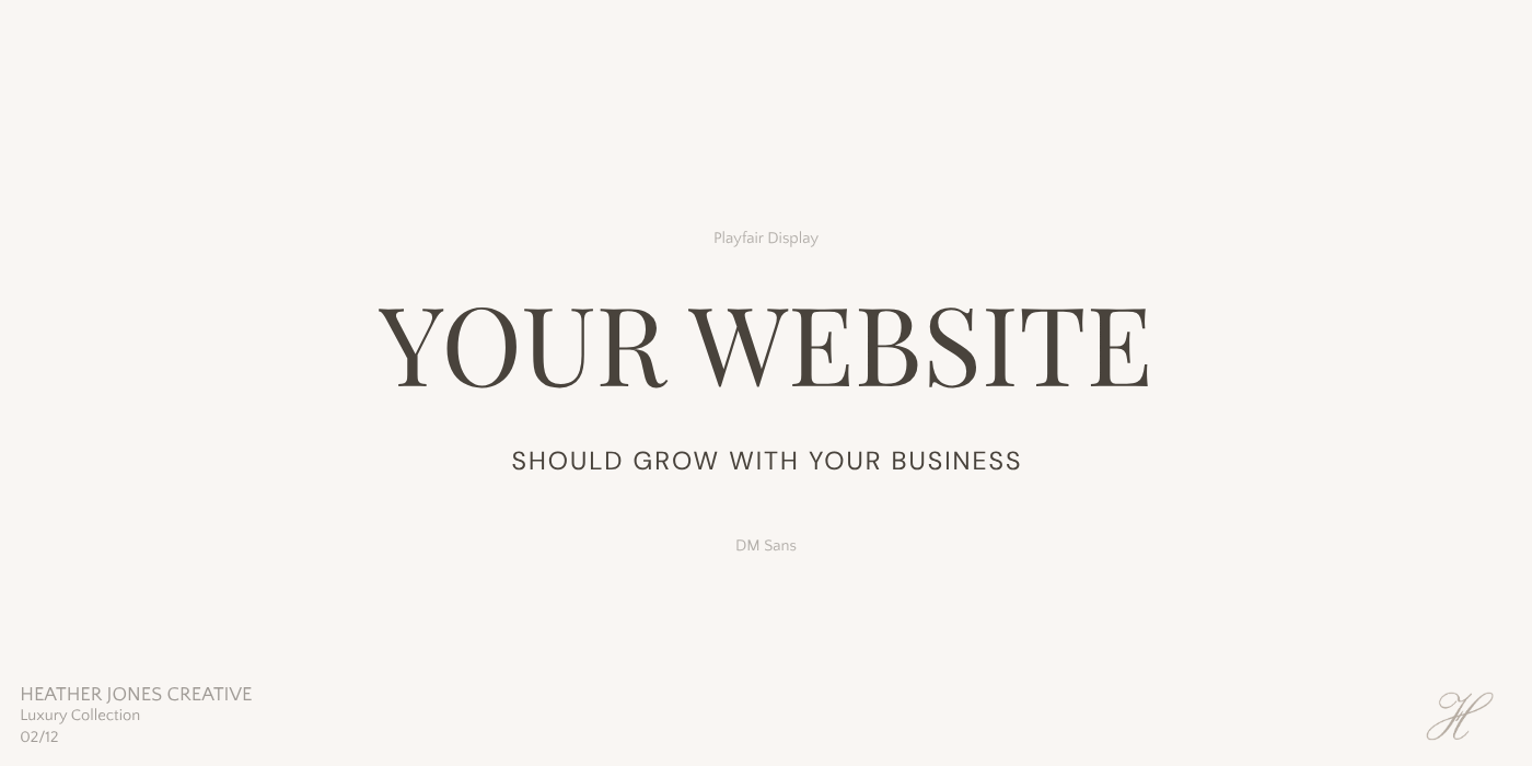
2. Playfair Display + DM Sans
Best For
Luxury Coaches, Wedding Professionals, Boutique Brands
Style
Classic • Feminine • Sophisticated
Why It Works
Playfair Display has become a classic for good reason. It feels elegant and established while remaining incredibly versatile across luxury industries.
Pairing it with DM Sans creates just the right amount of contrast. The clean geometric lines of DM Sans balance Playfair's decorative details, giving the overall website a polished and effortless look.
I especially love this combination for businesses that want to feel refined, welcoming, and timeless without appearing overly trendy.
💜 Heather's Tip
If your brand photography is soft and romantic, this pairing complements it beautifully without competing for attention.

3. Bodoni Moda + Inter
This one is stunning.
Best For
Luxury Brands, Interior Designers, High-End Service Providers
Style
High Fashion • Modern Luxury • Editorial
Why It Works
If your goal is to create a website that feels like it belongs in the pages of a luxury magazine, this pairing is hard to beat.
Bodoni Moda has dramatic contrast and striking letterforms that immediately command attention. It's bold without feeling loud.
Because Bodoni Moda has so much personality, I pair it with Inter, one of the cleanest and most readable sans-serif fonts available on Google Fonts. The simplicity of Inter keeps the design grounded while allowing the headlines to remain the focal point.
This is one of my favorite combinations for brands that want to feel elevated, artistic, and unforgettable.
💜 Heather's Tip
I avoid using Bodoni Moda in smaller text sizes. Let it be the star in your headings while Inter handles the heavy lifting everywhere else.
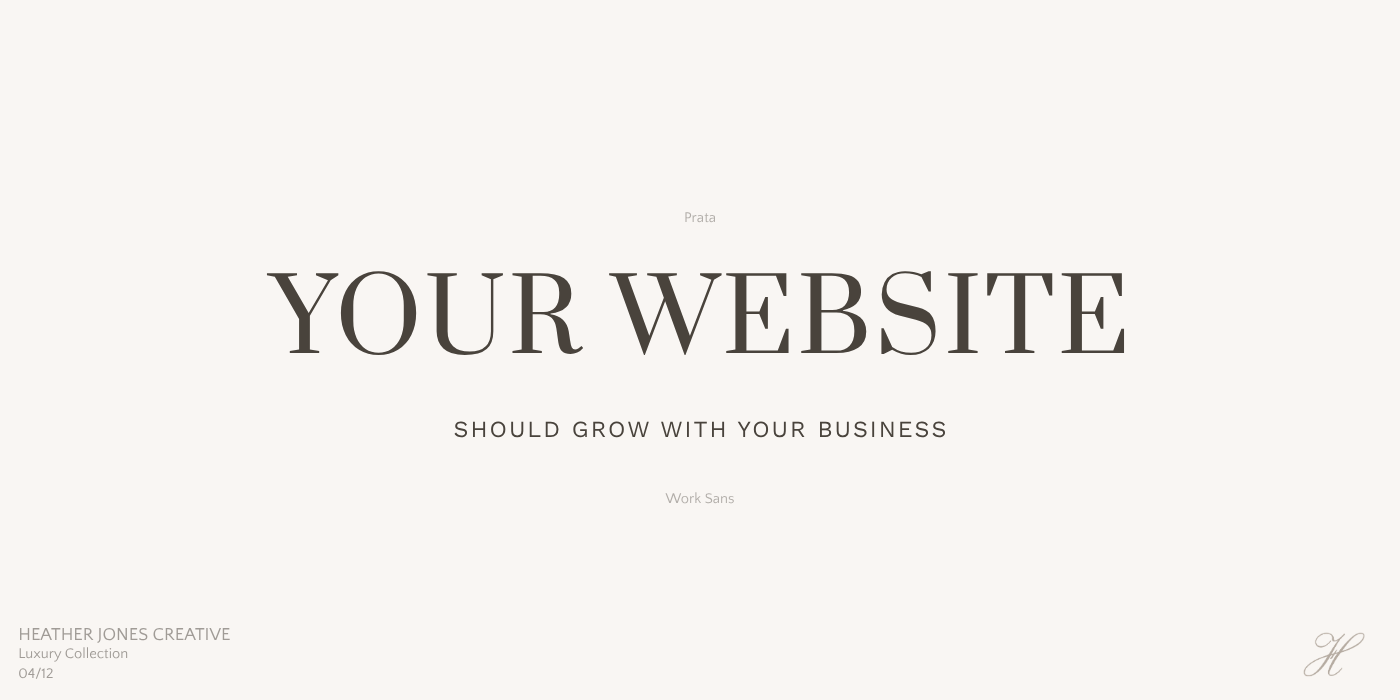
4. Prata + Work Sans
This pairing feels effortlessly expensive.
Best For
Interior Designers, Luxury Realtors, Boutique Hotels
Style
European • Refined • Quiet Luxury
Why It Works
Prata has a timeless elegance that feels sophisticated without trying too hard. It has just enough personality to create beautiful headlines while remaining incredibly readable.
I love pairing it with Work Sans because the simplicity of the sans-serif allows Prata to stand out without overwhelming the design. Together they create a calm, balanced aesthetic that feels both luxurious and approachable.
This is the kind of typography I gravitate toward when designing brands that want to communicate confidence through simplicity.
💜 Heather's Tip
This pairing shines when paired with oversized photography, neutral colors, and lots of white space.
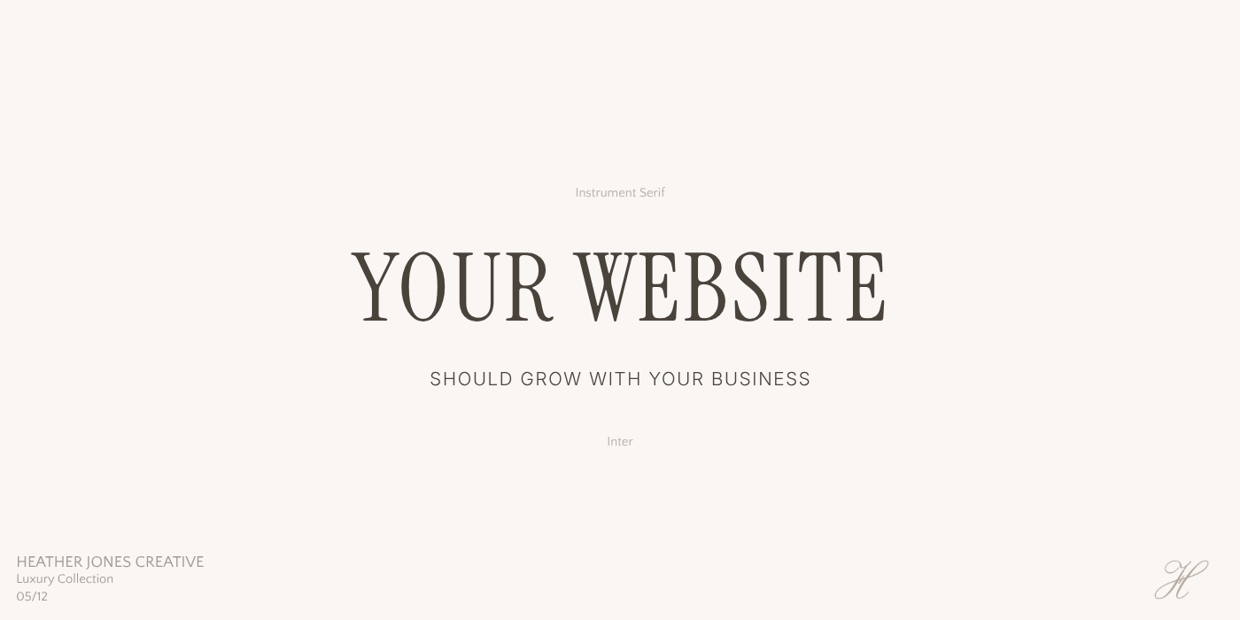
5. Instrument Serif + Inter
One of Google's best-kept secrets.
Best For
Luxury Coaches, Interior Designers, Boutique Service Providers
Style
Contemporary • Sophisticated • Minimal Luxury
Why It Works
Instrument Serif has a quiet elegance that feels modern without chasing trends. Its subtle curves and refined proportions give headlines a luxurious feel while remaining incredibly versatile.
I pair it with Inter because its clean, understated design keeps the overall website balanced and highly readable. Together they create a timeless look that feels calm, intentional, and beautifully understated.
💜 Heather's Tip
If your website uses generous white space and clean photography, this pairing will do most of the heavy lifting for you.

6. Fraunces + Manrope
One of the most underrated Google Fonts.
Best For
Creative Studios, Luxury Brands, Boutique Agencies
Style
Modern Editorial • Artistic • Sophisticated
Why It Works
Fraunces has an unmistakable personality. It feels contemporary, artistic, and slightly unexpected while still maintaining excellent readability.
Pairing it with Manrope keeps the overall design feeling balanced and modern. The contrast between the expressive serif and the clean sans-serif creates visual interest without making the website feel busy.
I love using this combination for brands that want their website to feel memorable from the very first scroll.
💜 Heather's Tip
Don't be afraid to use Fraunces in larger headline sizes. It's one of those fonts that becomes even more beautiful when given room to breathe.
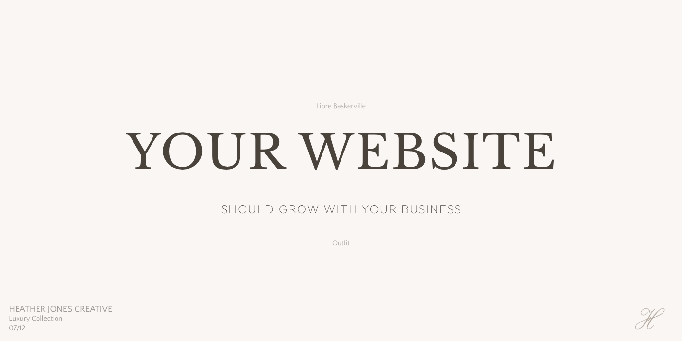
7. Libre Baskerville + Outfit
Best For
Luxury Consultants, Attorneys, Financial Professionals
Style
Timeless • Elevated • Refined
Why It Works
Libre Baskerville brings credibility and tradition without feeling dated. It's an excellent choice for businesses that want to communicate trust and professionalism.
Outfit introduces a clean, modern balance that keeps the website feeling current and approachable.
Together they create a refined aesthetic that's both classic and contemporary.
💜 Heather's Tip
If your brand leans more understated than feminine, this pairing is an excellent alternative to more decorative serif combinations.
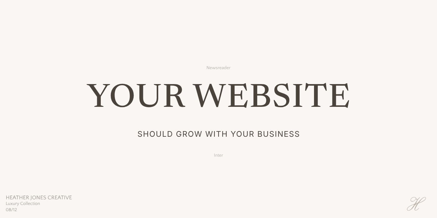
8. Newsreader + Inter
Quiet luxury in font form. (I'm using this font on my website now- see the large headings on this page in italics!)
Best For
Luxury Coaches, Copywriters, Lifestyle Brands
Style
Editorial • Understated • Sophisticated
Why It Works
Newsreader doesn't demand attention. Instead, it quietly creates an elevated feeling that becomes more noticeable the longer you spend with it.
Inter provides the perfect supporting role with its clean, modern simplicity.
This combination feels thoughtful, refined, and timeless without ever appearing trendy.
💜 Heather's Tip
This is one of my favorite pairings for brands that want to feel calm, intelligent, and quietly confident.
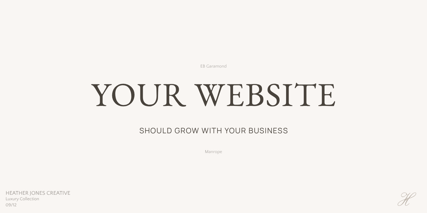
9. EB Garamond + Manrope
Best For
Wedding Professionals, Luxury Florists, Event Designers
Style
Parisian • Romantic • Elegant
Why It Works
EB Garamond has an old-world charm that instantly creates a romantic atmosphere. Its graceful letterforms feel timeless and sophisticated without becoming overly ornate.
Manrope introduces a clean modern contrast that keeps the design feeling fresh and easy to navigate.
Together they create a beautiful balance between tradition and simplicity.
💜 Heather's Tip
This pairing works especially well with soft photography and muted color palettes.
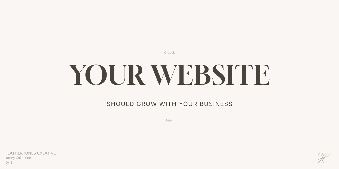
10. Gloock + Inter
If elegance had a typeface, this might be it.
Best For
Luxury Fashion, High-End Beauty Brands, Boutique Studios
Style
Editorial • Dramatic • Luxury
Why It Works
Gloock makes a statement without feeling overdesigned. Its elegant proportions and distinctive contrast immediately create a premium feel that's perfect for luxury brands.
Inter provides a crisp, modern foundation that lets Gloock take center stage without sacrificing readability.
This pairing feels bold, memorable, and undeniably luxurious.
💜 Heather's Tip
Keep your headlines short with Gloock. The font has plenty of personality, so a few carefully chosen words make the biggest impact.
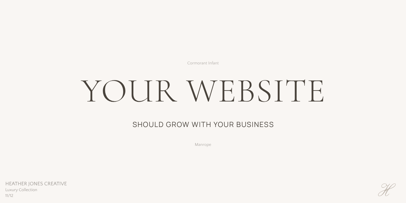
11. Cormorant Infant + Manrope
Best For
Luxury Lifestyle Brands, Boutique Wedding Professionals, Creative Studios
Style
Soft Luxury • Romantic • Editorial
Why It Works
Cormorant Infant has a softer personality than Cormorant Garamond while maintaining the same graceful elegance. It feels delicate, elevated, and effortlessly refined.
Pairing it with Manrope creates the perfect balance between classic beauty and modern simplicity, making this one of my favorite combinations for brands that want to feel luxurious without appearing overly formal.
💜 Heather's Tip
This pairing looks especially beautiful with warm neutrals, soft shadows, and oversized imagery.

12. Libre Caslon Display + Manrope
Saving one of my favorites for last.
Best For
Luxury Coaches, Authors, Creative Directors
Style
Sophisticated • Artistic • Editorial
Why It Works
Libre Caslon Display has an unmistakable editorial quality that immediately elevates a website. It feels artistic, thoughtful, and full of personality without becoming difficult to read.
Pairing it with Manrope creates a beautiful balance between expressive headlines and clean, modern body text.
If I wanted a website to feel quietly luxurious without following every design trend, this is one of the first combinations I'd consider.
💜 Heather's Tip
This pairing doesn't need a lot of decoration. Let the typography, generous white space, and beautiful photography do the work.
Before You Choose Your Fonts…
Typography is one of the smallest design decisions you'll make, but it has one of the biggest impacts on how your website feels.
The right font pairing can instantly make your brand feel more polished, professional, and memorable. Combined with beautiful photography, thoughtful spacing, and intentional design, typography helps tell your story before a single word is read.
Whether you're building a new website or refreshing an existing one, don't underestimate the power of choosing fonts that truly reflect your brand.
Ready for a Website That Already Feels Beautiful?
If you've fallen in love with these font pairings but aren't sure how to bring everything together, I've already done the hard work for you.
My collection of professionally designed Showit templates combines strategic layouts, intentional typography, and timeless design to help you launch a website you'll be proud of, without starting from scratch.
Whether you're a photographer, coach, interior designer, or creative entrepreneur, you'll find templates designed to grow with your business and leave a lasting first impression.
Beautiful design starts with thoughtful decisions, and your website deserves both.
A Final Thought
After designing websites for nearly two decades, one thing has remained true:
The most beautiful websites aren't the ones using the trendiest fonts.
They're the ones where every design decision works together to tell a consistent story.
Choose fonts that reflect your brand, not just what's popular.
Your future clients will notice the difference, even if they can't quite explain why.
Happy designing!