


")


Say goodbye to text-on-shape workarounds—Showit buttons now make it easy to add custom, clickable elements with hover effects and global styling.
If you have a Showit website, then you know the button struggle was real. 😅
For years, we had to get creative—layering text boxes on top of shapes and making them look like buttons. And while it worked (kind of), it wasn’t exactly intuitive. Not to mention… no real hover states, no easy way to update buttons globally, and no quick styling shortcuts.
But guess what? That’s all in the past now!
Showit recently rolled out a brand new Button feature, and it is so good. Whether you’re a website owner, DIYer or a designer who’s been waiting (and waiting) for this update, you’re going to love how easy this new functionality makes it to add professional, consistent buttons across your site.
Let’s dive into the details!
What’s New with Buttons in Showit?
With this update, Showit has added:
- Default Button Styles you can set once and reuse across your entire site
- Hover States for interactive effects
- The ability to customize buttons on a per-instance basis
- A way to convert old “fake” buttons (aka shapes + text) into real buttons
Basically, it’s everything we’ve been wishing for in one beautiful update.
How to Create Default Button Styles
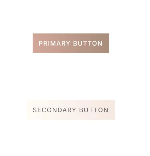
First things first—set your default button styles! This is where you’ll create a Primary and Secondary button design to use across your pages.
To do this:
- In Showit, go to Design Settings
- Click on the new Buttons tab
- Customize your Primary and Secondary button styles
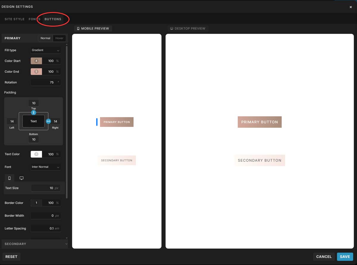
You can adjust:
- Font, size, and padding
- Background color and border
- Corner radius
- Hover effects (woohoo!!)
You can even preview your Normal vs. Hover styles while you work. This means when someone hovers over your button, it can change color, invert, or even animate—whatever you’d like!
💡 Pro tip: Keep your Primary button for your most important CTAs (like “Book Now”) and use the Secondary style for less urgent links.
Adding a Button to Your Canvas
Once your default styles are set, you can add buttons anywhere on your site with just a few clicks.
Here’s how:
- Select the canvas you want to add a button to
- Hover over the Element icon in the Bottom Toolbar
- Click Button
- Done! Your default button will appear, and you can move or resize it however you’d like
Want to tweak that specific button (without changing the global style)? Click the button, go to the Button Style tab, and choose + Customize to override anything you need—like size, font, or hover effect.
Convert Existing “Fake” Buttons into Real Ones
Already have a bunch of text-on-shape buttons on your site? You don’t need to recreate them from scratch.
Here’s how to convert them:
- In the Site Panel (left sidebar), find the text and shape that make up your button
- Hold Command (Mac) or Control (PC), then click both elements to select them
- Right-click and Group them
- Look for the Convert to Button option in the right Properties Panel
- Boom—it’s now a real button!
🚫 Just note: this only works if it’s one text box and one shape—icons or multiple layers won’t convert.
Customizing Individual Buttons
Do you need to change a specific button? You can fully customize any button without affecting your global styles.
To do this:
- Click the button on your canvas
- Click the Button Style tab
- Click + Customize
- Adjust font, background, hover, border radius, and more
This is perfect for one-off pages, launch CTAs, or adding a bit of flair to a sales page.
Why This Is a Big Deal
This update may seem small, but for us designers and Showit lovers, it’s HUGE.
Here’s why:
- Consistency: Your buttons can now match across every page with one click
- Ease of use: No more manually aligning shapes and text
- Professional polish: Hover effects make your site feel more dynamic
- Saves time: Faster to build, faster to update, faster to launch
Whether you're creating a new site from scratch or updating your existing one, this is the perfect time to go back and give your buttons a little glow-up.
Final Thoughts (and a Challenge for You!)
If you’ve been putting off refreshing your site or making things more click-friendly—this is your sign. Go play around with the new button feature and give your CTAs the attention they deserve.
Related Article: How to Create Irresistible CTAs
Want help updating your site with the new buttons? Just reach out and let me know!


