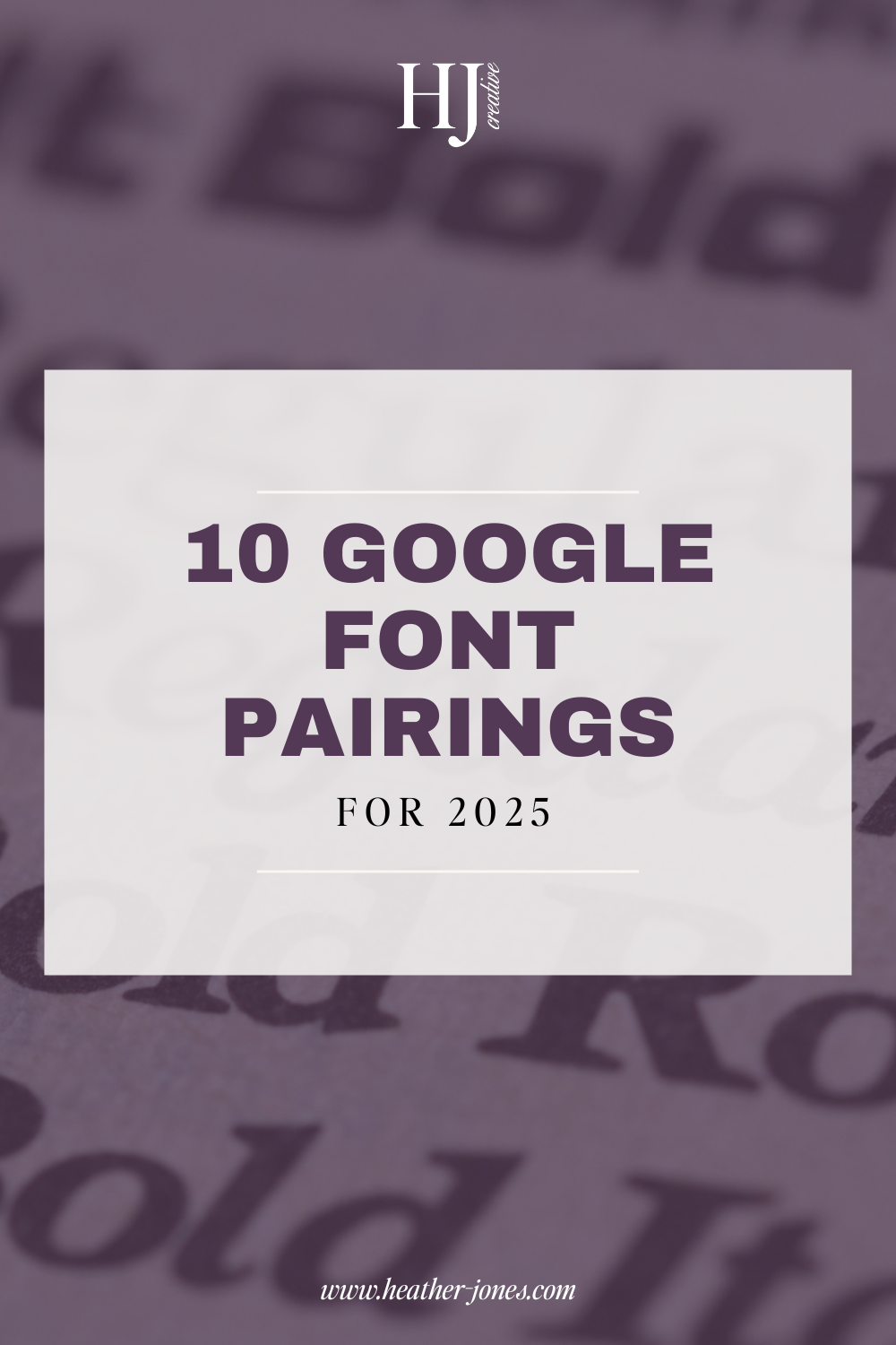
Elevate your website with these 10 beautiful Google Font pairings that are stylish, readable, and totally free!

Your website’s typography sets the tone for your brand. Whether you want a clean and modern vibe or something elegant and timeless, choosing the right Google Font pairings can instantly elevate your design.
The best part? Google Fonts are completely free and optimized for web use, making them a go-to choice for designers and business owners alike.
I’ve rounded up 10 stunning Google Font pairings that will give your website a professional, polished look. Let’s dive in!
1. Playfair Display & Montserrat
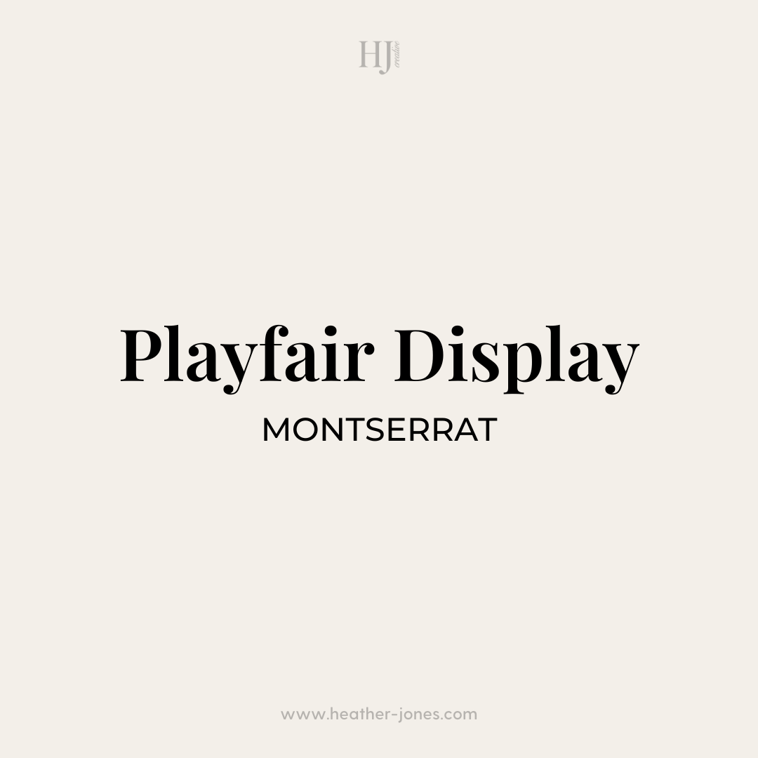
Elegant meets modern – Playfair Display brings a refined, high-end serif feel, while Montserrat keeps things structured and contemporary.
📌 Best for: Luxury brands, photographers, and creative entrepreneurs.
2. Poppins & Lora (Italic)
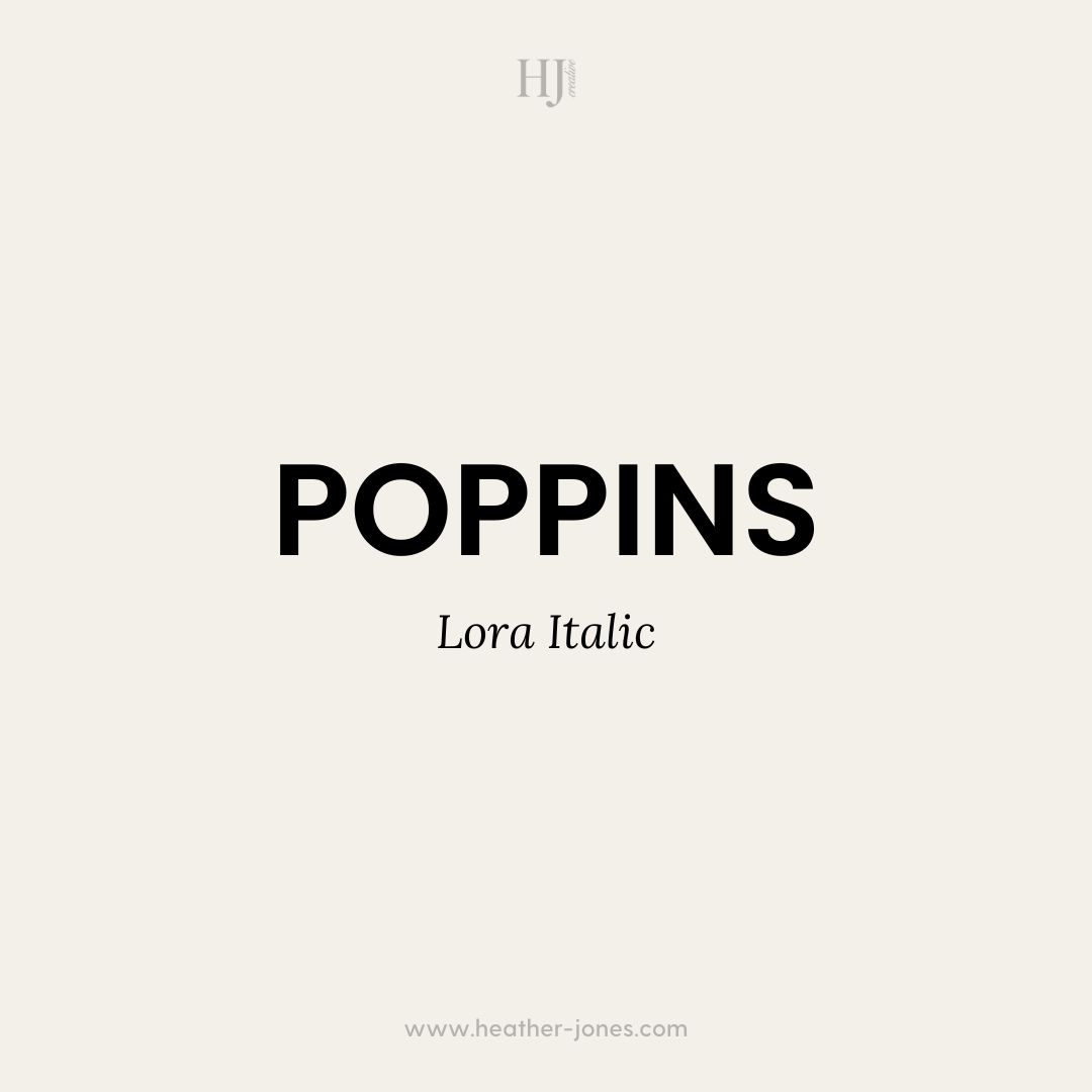
Minimal & sophisticated – Poppins is a bold, geometric sans-serif, while the italic Lora adds a soft, classic serif touch.
📌 Best for: Lifestyle brands, coaches, and bloggers.
3. Raleway & Roboto
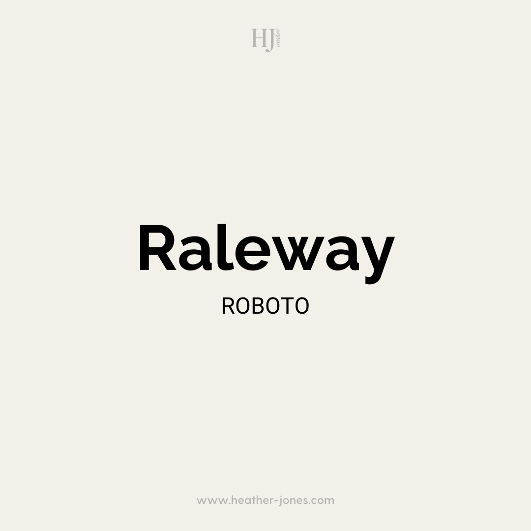
Sleek & professional – Raleway has a light, airy feel, while Roboto is ultra-readable, making this pairing both stylish and functional.
📌 Best for: Service providers, agencies, and tech brands.
4. Merriweather & Open Sans
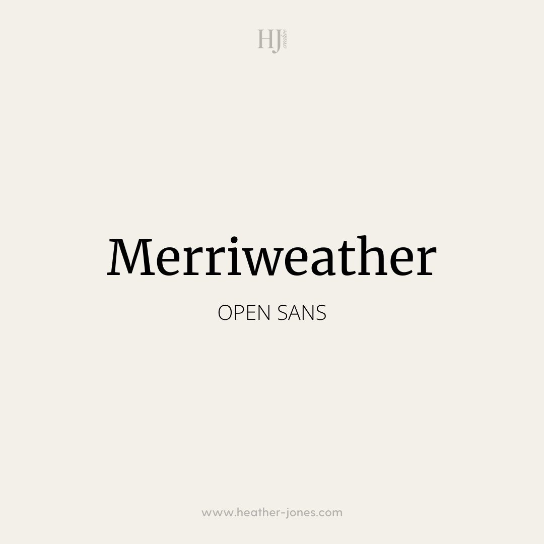
Classic & clean – Merriweather’s slightly condensed serif pairs beautifully with the simplicity of Open Sans.
📌 Best for: Writers, consultants, and brands that want a sophisticated but approachable style.
5. Abril Fatface & Lato
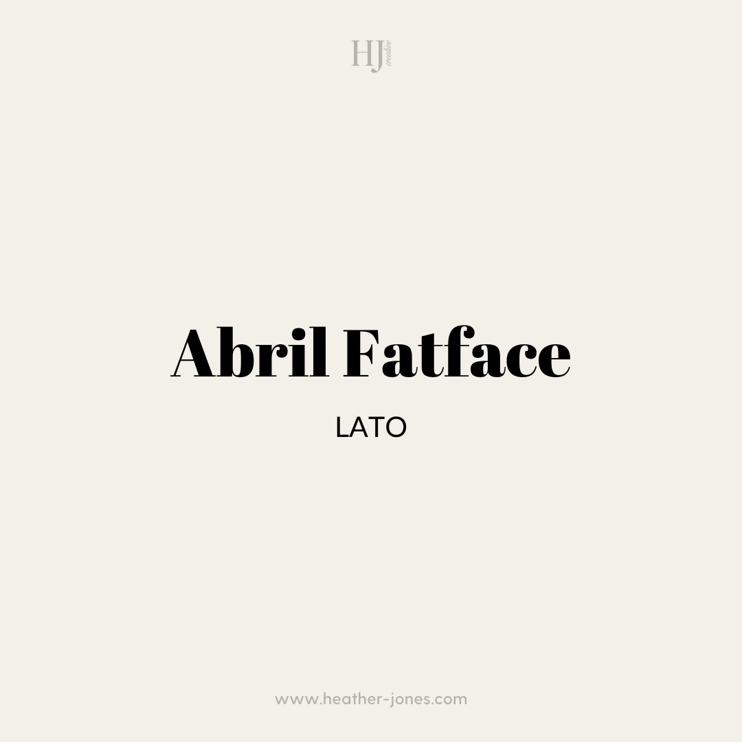
Bold & balanced – Abril Fatface is striking and attention-grabbing, while Lato’s smooth sans-serif balances it out perfectly.
📌 Best for: Fashion brands, creative entrepreneurs, and bloggers.
6. Nunito & Cardo
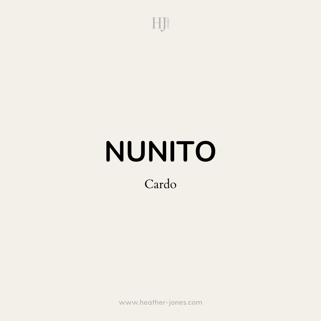
Modern meets classic – Nunito is rounded and friendly, while Cardo has an old-world elegance that adds depth.
📌 Best for: Artisans, wellness brands, and businesses that want a warm, inviting feel.
7. DM Serif Display & Poppins
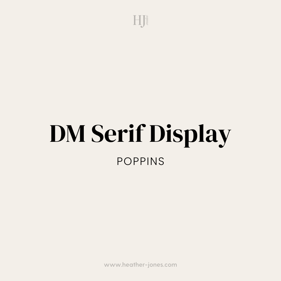
Sophisticated & structured – DM Serif Display brings a high-end, editorial feel, while Poppins adds a fresh, modern edge.
📌 Best for: Designers, wedding professionals, and upscale brands.
8. Oswald & Quattrocento
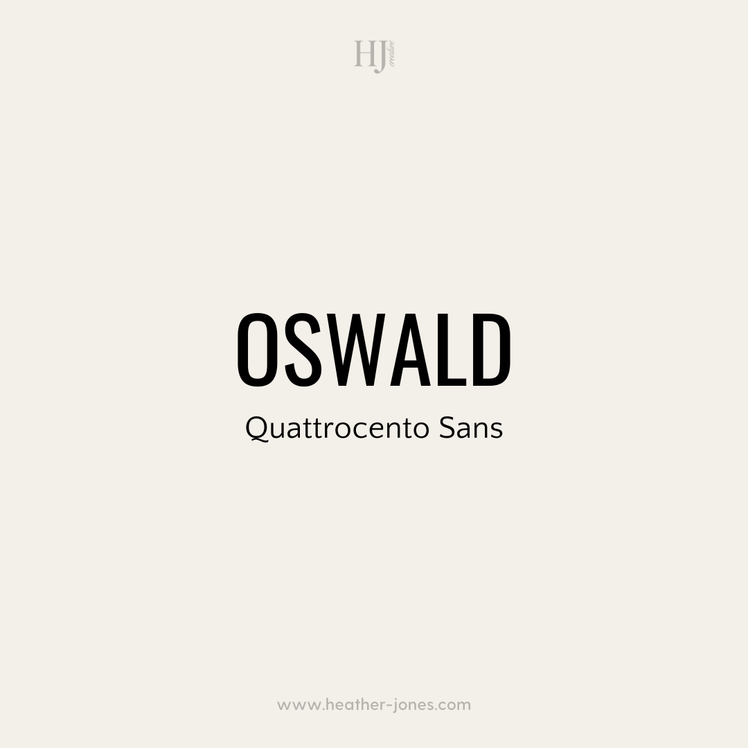
Bold & refined – Oswald’s condensed style commands attention, and Quattrocento’s elegant serif softens the look.
📌 Best for: Bold brands, fitness websites, and statement-making businesses.
9. Cormorant Garamond & Work Sans
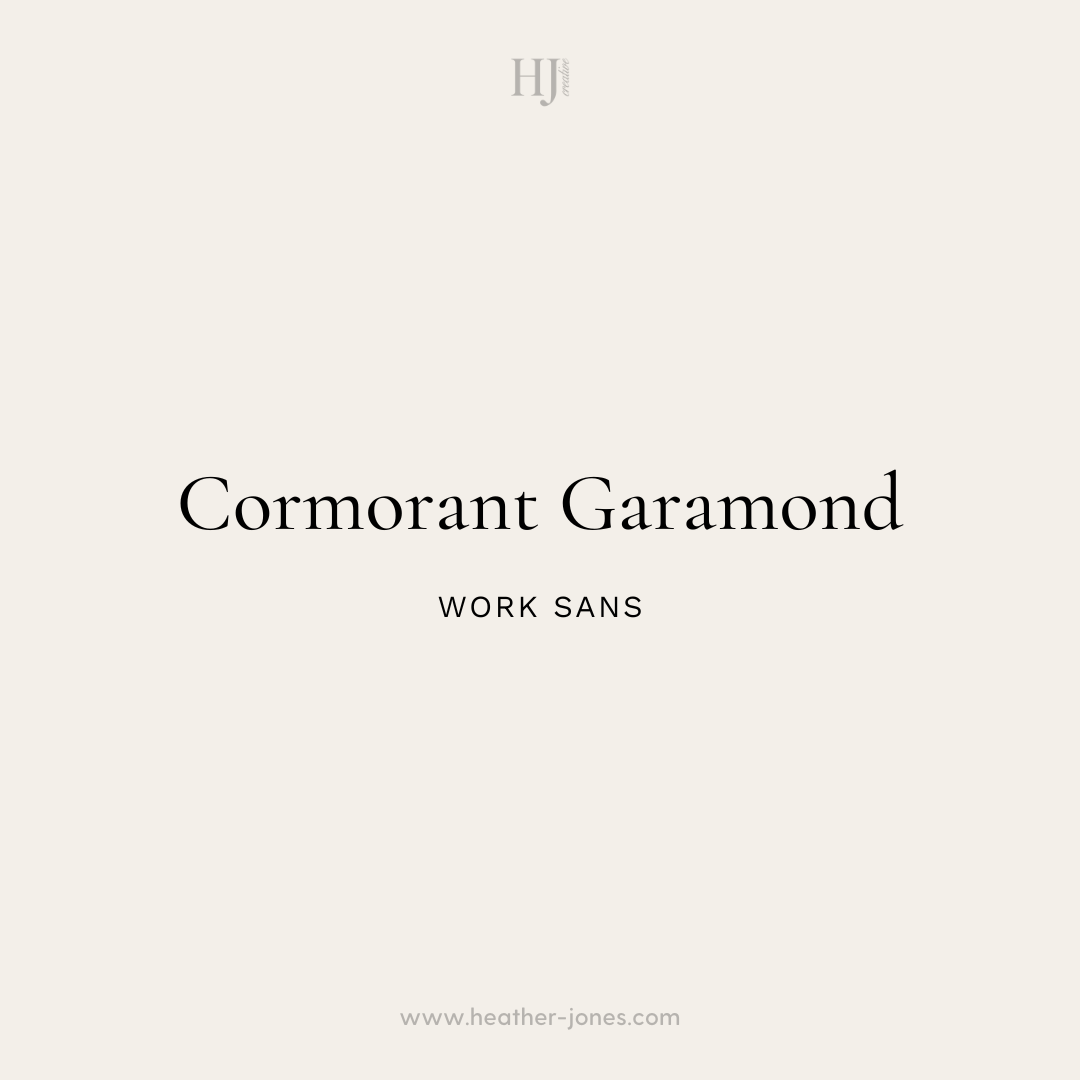
Timeless yet modern – Cormorant Garamond has that luxury, high-fashion feel, while Work Sans keeps things grounded and easy to read.
📌 Best for: Creative agencies, artists, and high-end service providers.
10. Josefin Sans & PT Serif
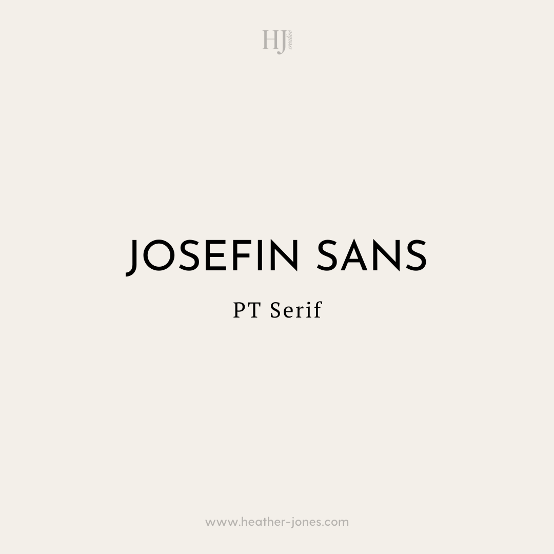
Quirky & polished – Josefin Sans has a distinct, geometric style, while PT Serif adds a refined touch.
📌 Best for: Unique brands, boutique shops, and personality-driven businesses.
🔥 Bonus: Manrope & Recursive
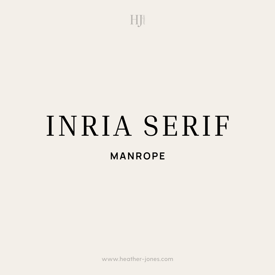
Cutting-edge & dynamic – Manrope is a sleek, variable sans-serif with a contemporary edge, while Inria Serif adds a classic vibe.
📌 Best for: Startups, tech brands, and forward-thinking creatives who want a modern, innovative feel.
Tips for Using Google Font Pairings on Your Website
Typography can make or break your website’s design. Here are a few simple tips to make sure your fonts look polished and professional:
✅ Stick to 2-3 fonts max – Using too many fonts can make your site look messy. A good rule of thumb: one for headings, one for body text, and an optional accent font.
✅ Choose readable fonts – Fancy scripts and decorative fonts should be used sparingly. Stick with clean, easy-to-read fonts for body text.
✅ Create contrast – Pair a serif with a sans-serif, or use different font weights (bold vs. regular) to create visual interest.
✅ Keep branding in mind – Make sure your fonts align with your brand’s vibe. Playful? Elegant? Modern? Your typography should reflect that.
✅ Check mobile readability – Some fonts look great on desktop but are hard to read on smaller screens. Always test your fonts on mobile devices!
Why Google Fonts Are a Great Choice for Your Website
Google Fonts aren’t just stylish—they’re also super practical. Here’s why they’re a smart choice:
- They’re free – No licensing fees, ever.
- They load quickly – Designed for web performance, so your site stays speedy.
- Tons of variety – Hundreds of fonts to mix and match.
- Easy to use – No need to download files or mess with custom uploads.
Using Google Fonts Pairings on Showit
If you’re a Showit user, you have an extra advantage—Google Fonts are already built into the platform! That means you can simply select your fonts from the list inside Showit, apply them to your site, and you’re all set. No extra uploads or installations needed!
Now, it’s time to pick your perfect pairing and give your website a typography glow-up! Which combo is your favorite? 💕 Can't decide? Let me help you!